

In this digital age, a well-designed website is crucial for any business looking to make an impact online. A website that is easy to navigate and visually appealing can significantly enhance user engagement and conversion rates.
In this article, we'll explore practical steps you can take to enhance your website's design. We'll cover optimizing navigation, improving visual elements, and ensuring your site is mobile-friendly.
Optimize Navigation and User Experience
A key aspect of improving the design of your website is to focus on user-friendly navigation. Visitors should be able to find what they're looking for quickly and effortlessly. A clear menu structure and intuitive layout contribute to a positive user experience.
Simplify your site's navigation by limiting the number of menu items and organizing content logically. Consider using dropdown menus for better organization if your site has multiple pages or categories. This makes it easier for users to explore different sections without feeling overwhelmed.
Additionally, incorporating call-to-action buttons and internal links can guide visitors through your site effectively. By enhancing usability, you're not only improving your site's design but also encouraging visitors to stay longer and engage more with your content.
Enhance Visual Appeal
Another way to upgrade your site's layout is by enhancing its visual appeal. An attractive design draws visitors in and makes your content more engaging. Use high-quality images, consistent color schemes, and readable fonts to create a professional look.
It's important to maintain consistency across all pages. This means using the same style of images, fonts, and colors throughout your site. Consistency helps establish your brand identity and makes your website appear more cohesive.
Don't forget about whitespace, which can make your site look clean and uncluttered. Adequate spacing between elements allows the content to breathe and improves readability. By paying attention to these details, you can significantly improve the overall design of your website.
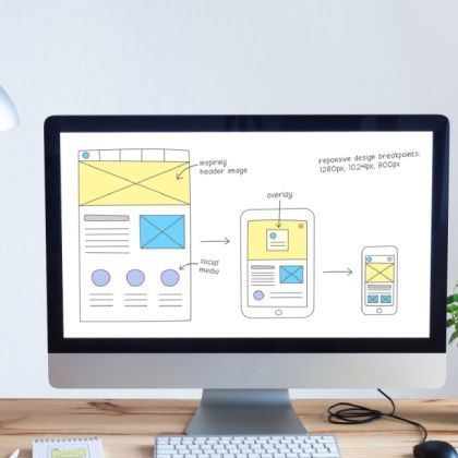
Ensure Mobile Responsiveness
With the majority of users accessing websites from mobile devices, making your site mobile-responsive is essential. Improving your website's design to be compatible with various screen sizes enhances user experience for all visitors.
Implement responsive design techniques so that your site adjusts automatically to fit the screen of any device. Test your website on different devices to ensure that images, text, and navigation menus display correctly.
Mobile responsiveness not only benefits users but also improves your site's ranking on search engines. Search engines favor mobile-friendly sites, which can lead to increased visibility and traffic.
In Conclusion
Improving your website's design doesn't have to be complicated. By optimizing navigation, enhancing visual appeal, and ensuring mobile responsiveness, you can create a more engaging and user-friendly site that meets your visitors' needs.
If you're ready to take your website to the next level, our team at Blue Goat Digital can help. Get a free quotation for website builds and digital marketing services, or contact us with any questions. We're here to assist you in creating a website that stands out from the competition.