

In today's digital age, having a website that looks good on all devices is more important than ever. People are using smartphones, tablets, and desktops to browse the internet, and they expect a seamless experience no matter how they access your site.
This article will explore what responsive website design is, why it's crucial for businesses, and the benefits it brings in terms of user experience, search engine optimization, and staying ahead of the competition.
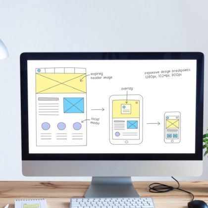
Understanding Responsive Website Design
Responsive website design is an approach to web development that allows a site to adjust its layout and content based on the screen size and orientation of the device being used. Whether someone is viewing your site on a large desktop monitor or a small smartphone screen, the site adapts to provide the best possible experience.
This flexibility is achieved through the use of flexible grids, images, and CSS media queries. It ensures that users don't have to zoom in or scroll horizontally to read content or navigate the site. Essentially, it's about creating websites that automatically respond to the user's device preferences.
By embracing the importance of responsive website design, businesses can ensure their websites are accessible and user-friendly on any device. This not only improves user satisfaction but can also lead to increased engagement and conversions.
Enhancing User Experience
User experience is at the heart of any successful website. When visitors can easily navigate and interact with your site, they're more likely to stay longer and engage with your content. A responsive design helps provide a consistent experience across all devices.
Imagine a potential customer visiting your site on their phone and finding it hard to read text or click buttons. They might quickly leave and look for a competitor whose site is mobile-friendly. By ensuring your website design is responsive, you cater to all users, keeping them on your site longer. This highlights why responsive design matters for your business.
Moreover, a positive user experience can lead to word-of-mouth referrals and repeat visits. Responsive design isn't just about technology; it's about understanding and meeting the needs of your audience, which ultimately can boost your business's reputation and success.
Boosting Search Engine Rankings
Search engines like Google prioritize websites that offer a good user experience. Having a mobile-friendly website is a crucial factor in search engine optimization (SEO). It can improve your site's visibility in search results, making it easier for potential customers to find you.
Google has even stated that mobile-friendliness is a ranking signal. A site that isn't optimized for mobile devices may not rank as well, meaning you could be losing out on valuable organic traffic. Recognizing the importance of responsive design ensures your site meets these important SEO criteria.
By incorporating responsive design, you make it easier for search engines to crawl and index your site. This unified approach avoids the need for separate mobile and desktop versions, simplifying your SEO efforts and potentially improving your rankings across all devices.
Staying Ahead of the Competition
In a crowded online marketplace, standing out from the competition is essential. A responsive website can set your business apart by providing an exceptional user experience that others might lack. It's about meeting and exceeding the expectations of modern consumers.
As more businesses recognize the significance of having a mobile-friendly website, those who haven't adapted risk falling behind. By prioritizing responsive design, you show your audience that you value their convenience and are keeping up with the latest technology trends.
Investing in responsive web design isn't just a technological upgrade; it's a strategic business move. It positions your company as forward-thinking and customer-centric, giving you an edge over competitors who haven't yet embraced this essential aspect of web development.
In Summary
Responsive website design is no longer a luxury—it's a necessity. It ensures your website provides a seamless and enjoyable experience for all users, regardless of the device they use. By making your site accessible and easy to use, you can reach a wider audience and improve overall satisfaction.
If you're looking to upgrade your website to be fully responsive and want to reap the benefits it brings, consider getting a free quotation from our team. We're here to help you build a custom website that not only looks great but also enhances your digital marketing efforts.